How To Create An Aesthetic Journal Layout - Part 2
We all want our journal pages to look pretty, right? So how can we create aesthetic journal spreads.
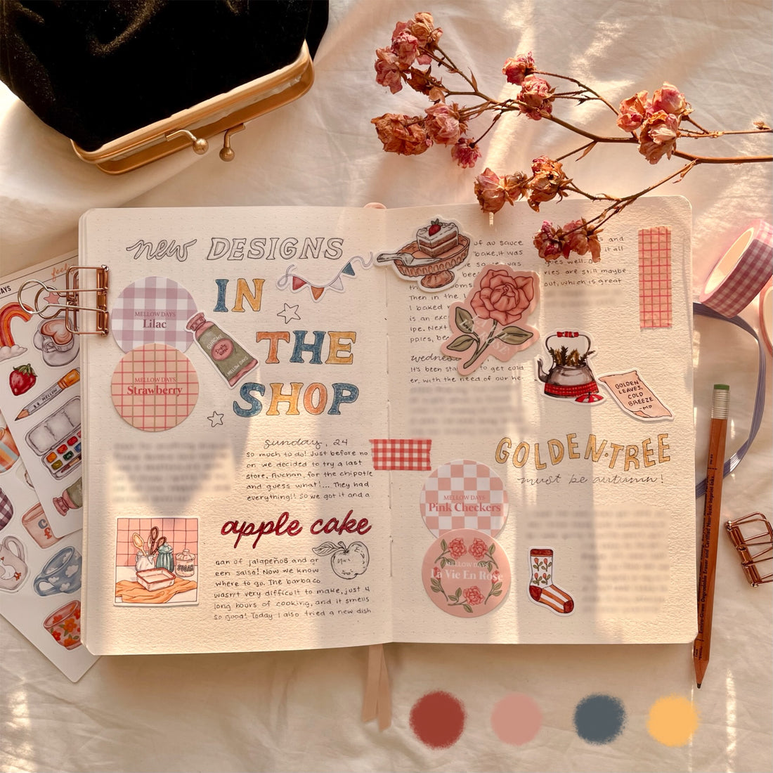
I’ve been journaling for awhile now, and have learned that my favorite pages have a good color scheme, aesthetic stickers, pretty washi tape, some unique lettering, and drawings. All of these elements together can create an aesthetic page when done correctly.
So how can I make my journaling look aesthetic?
To create an aesthetic theme layout you need a balanced color scheme, or in other words a harmonious color palette by using your stationery supplies and decorations.

How To Choose The Best Colors?
The colors are important because they can reflect a mood or feeling. When colors are paired correctly together, they help your page stand out nicely. You can choose bold bright colors, softer pastel tones, or a mix of both. Also, I just want to say you don't need to add a lot of color if you don't want, it can just be a hint of color or as colorful as you want!
How To Add Color?
You can add color with paints, markers, pens, but also with stationery such as washi tape, paper scraps, and the stickers you choose. I like to match my masking tape to the color scheme in my layout. As stickers are normally different colors, you can match and see how they will fit your page. Pretty stickers add a unique touch in detail and colors.
And you can always paint an area for color or add an illustration if you like to draw, then match the rest of the colors according to your painting.

Which Colors Should I Choose?
I personally select colors that I like, my favorite being pink, so my journal pages often have this color. So start by choosing your favorite color. Choose colors that go well together or why not a single color but in different varying shades.
If you want to create a soft aesthetic layout use colors that are in light pastel tones or more neutral colors like beige. If you want a color that stands out, use it more in your spread or make it darker than the rest, but make sure that it still fits the color scheme.

If you aren’t a big fan of pastels but love bright and bold colors than use a few colors that go nicely together. I usually try to stick with 3 main colors at the most in general for everything.

And always experiment! I do, and sometimes I get a happy result and sometimes not so nice, and learn to not use those colors together again for next time.
Another thing is it’s okay to reuse the same colors over and over again. This perhaps means that these are your favorite colors and represent YOU.
If you still need help and ideas on how to create an aesthetic layout you can read more tips here : How To Create An Aesthetic Journal Layout Part 1 in this article I explain how to create a balanced layout. I think this goes hand in hand with choosing a good color scheme, but it's the base for your page of your bullet journal layout.
2 comments
very helpful
Thank you so much for these two articles. They were very helpful and much appreciated.