How To Create An Aesthetic Journal Layout Part 1
Share
Looking for ideas and help on how to create an aesthetic journal layout? Today I’m giving you some helpful tips on how to do this!

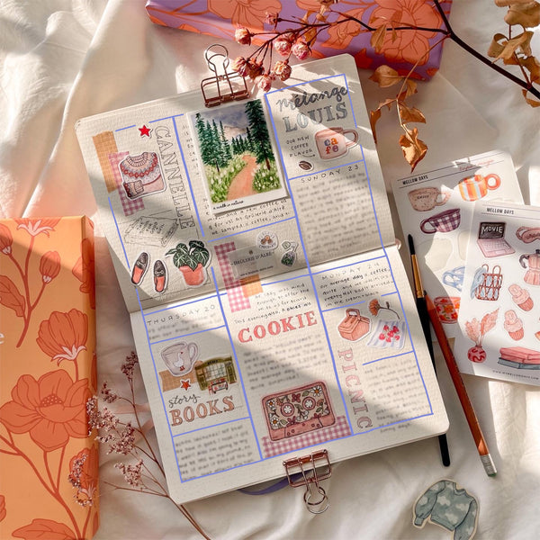
The layout of your page is important and what I’ve discovered to be the most helpful is to draw out guidelines to follow. This will help so you know where to fill and where to leave space. I’ve tried many different page layouts on my Rêverie Journals throughout the years, some I prefer over others. Below are things I've learned and tried for filling up my bullet journal pages.

How To Fill Your Journal With Beginner Guidelines :
1. To separate the writing sections or days, make space for adding stickers, washi tape, drawings, or cutouts… something to decorate your page.
2. Balance the journal layout with writing and decoration to create a pretty aesthetic. To do this lightly trace with a pencil, columns or squares to follow as a guide. Fill these spaces only, but of course you can modify these if you need to, and also try now layouts. It’s always fun to experiment and change things around when you journal, it’s a place for creativity!

3. I always like to add my decorations (stickers, washi tape, etc.) as I fill my pages, meaning I don’t pre setup or decorate my journal pages by adding everything in the beginning, I do it as I go.This is just my preference and works better for me.
4. Divide up you page into sections, leaving empty space and borders. Currently I’ve been organizing my writing in vertical columns, two per page, (as you can see in my photos). I also leave a slight border around the edges about two dot grid spaces, or 2 cm.
I have tried filling up my page entirely, or less leaving spaces around. For the moment I prefer less crowded pages, this is of course personal taste. As you begin to journal more you will discover which journal layouts work best for you and which ones you like better!

Check out this next post, How To Create An Aesthetic Journal Layout Part 2 for help on how to choose the correct color scheme.
Ready to Start Your Journaling Journey?
Explore our curated collection of premium journals and art supplies
Discover Our Collections
14 comments
Soo beautiful
I like it so much 😻
A LOVE YOU
your a really talented artist thanks for all the inspiration you have filled my heart with
Your idea is very beautiful , my diary will became extraordinary ……hmmmmm…… Thank you very much for your creation I like your design very much